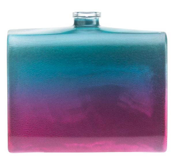

At Molteni Glass we utilize a type of varnish in which water acts as a diluent and a carrier of the resins that form the finish. Compared to solvent-based paints, this reduces VOC emissions by 95%.
At Molteni Glass we rely solely on waterborne single-component and two-component paints. These are more sustainable, low-toxic, completely odourless, uninflammable, and available in all colours.
This type of paint is then refinished by applying a protective topcoat – transparent or pigmented – which ensures excellent hardness and brightness for products that are made to last.

To create a charcoal gray finish for this unique shaped gin bottle, we faced the challenge of recreating the same hue that had already been used for the rhinestones that grace its polished, semi-transparent version. Easier said than done! Plus, we had to consider the fact that variously sized rhinestones refract the light unevenly. By using a unique blend of colours, we managed to recreate the desired hue, which gives the bottle a unique sense of depth and a sophisticated elegance.

To make a set of table candles unique and precious, we created a silver glitter and pearl iridescent decoration. The tricky part of this project was correctly treating the shapes and curves of the object to best enhance its aesthetic appeal.
Using a flat colour would have diminished the candle’s elegance, while a brighter hue would have disproportionately enlarged the object, hence causing it to lose the refined look requested by the client. To achieve a balanced effect, we suggested (and created) two complementary finishes that would not alter the shape of the candle while also appropriately conveying a sense of elegance and refinement.
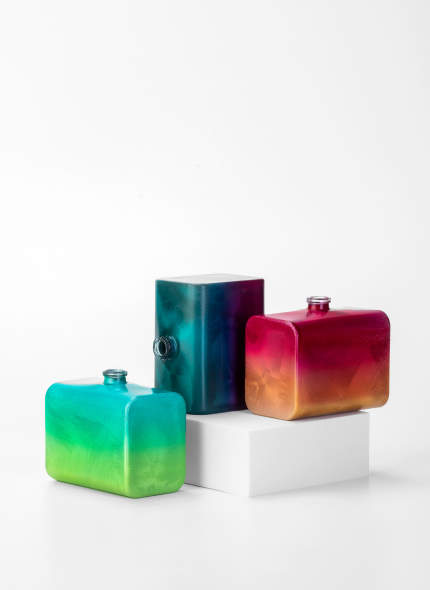
Our client requested a special finish that could reflect the perfume pyramid of the luxury fragrance line they wanted to create. To best fulfil this request, we worked together to analyse the impact of the various fragrances and the product packaging designs on consumers’ perception.
From there, we created a project proposal based on a floral pattern with a gradient effect. We sought to enhance the top, heart, and base notes of every fragrance, and eventually we created a progressive and dynamic nuance that encompasses two different tones to achieve a harmonious look and feel. It was a multisensory project: a union of form and substance.

This project consisted in the creation of a polished, semi-transparent base which we then decorated by applying rhinestones of various colours. In this case, we faced the challenge of achieving a perfect level of compatibility between the water-based coating and a durable and resistant decoration that was meant to transform the packaging into a long-lasting design object.

For this project, our client asked us to create a matt white base which would then be personalised with a thermal transfer design. This particular technique can be used to transfer multiple colours simultaneously thus achieving a “tattoo effect”. The result is that the colours appear fuller and more vivid, even in the case that a shiny or matt effect is used. The object turns into a sort of white canvas, ready to be customised to one’s taste.
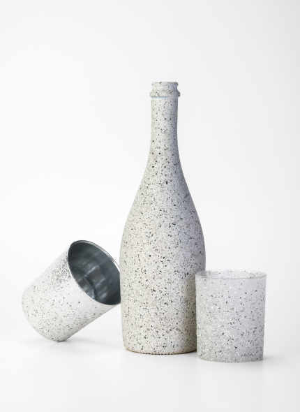
This client, who owns a winery in the Langhe wine region of Northern Italy, asked us to create a bespoke bottle with a rough texture for a tactile packaging effect. To fulfil this request, we proposed a “stone effect” finish which our client absolutely fell in love with, so much so that they decided to apply the same finish on a set of scented candles that now grace the tables of the winery’s restaurant.
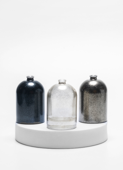
To convey the visual essence of a glam fragrance line, we suggested using some glitter to serve as a unifying thread for different background colours depending on the fragrance.
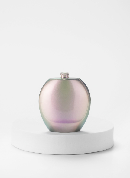
For this luxury perfume packaging project, our client wanted us to create an iridescent finish with translucent violet and lilac nuances. We therefore proposed a unique version of an iridescent film with translucent violet and lilac nuances. The result? A perfume that stands out at first sight.
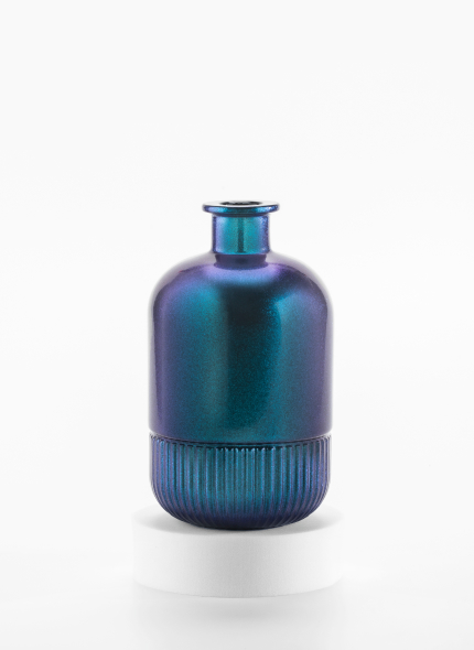
For this particular home fragrance inspired by the Italian island of Capri, our client wanted us to create a packaging solution that would immediately remind one of the island’s distinctive blue skies, and its iconic local flower: the oleander. To best represent the enchantment of Capri, we proposed an iridescent chromatic effect characterised by a deep blue heart and a series of rosy hues to evoke the typical colour of an oleander in full bloom.
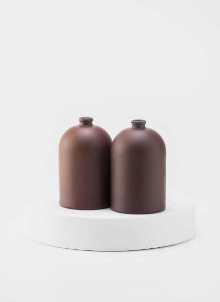
With the intention of promoting a set of perfume bottles while making them unique and highly recognizable, a renown Italian brand asked us to create a particular type of finish that would be suitable to reproduce the visual and tactile effect of one of their most popular bags. To do so, we applied the technique of crackle painting using a specific pantone colour that we designed in collaboration with the client. The result was a unique leather effect, ready to be displayed across the brand’s store locations.
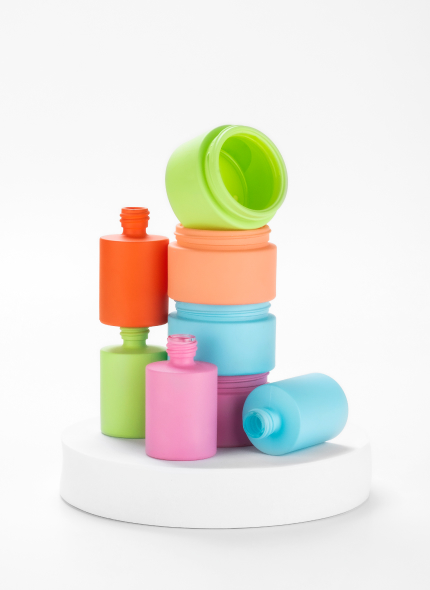
To enhance the packaging design of a set of women’s cosmetic containers for face cream and eye serum, we created 5 different matt colour solutions. We presented our client with a spring pastel colour palette designed to develop an effective and recognizable cosmetics line.
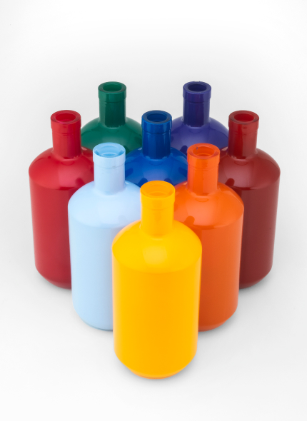
One of our clients requested some custom design bottles to be turned into unique display pieces. Specifically, they asked us to recreate the typical colours of billiard balls. It was with great pleasure that we took up this challenge of turning their passion into a timeless design object! All in all, it was an enjoyable and stimulating project which required us to test a series of custom paints, which we then brought to life.
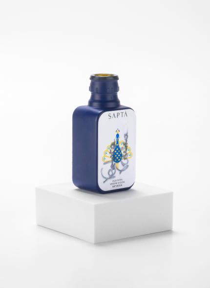
We designed a range of exclusive oil bottles for Olio Saptà, a top-notch olive oil brand whose innovative and unique packaging received the “gourmet oil” award in a national packaging and visual design competition titled “Forme dell’Olio 2024”. This one-of-a-kind bottle is able to convey the exceptional taste of the olive oil produced by the Ventura family.
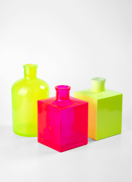
For a set of home fragrance diffusers in large formats, the client asked us to create a fluorescent coating in two versions – opaque and transparent. To this effect, we recommended using two different fluorescent colours that could best mirror and convey the values and the exclusive personality of this brand. We then created the two versions requested by the client.
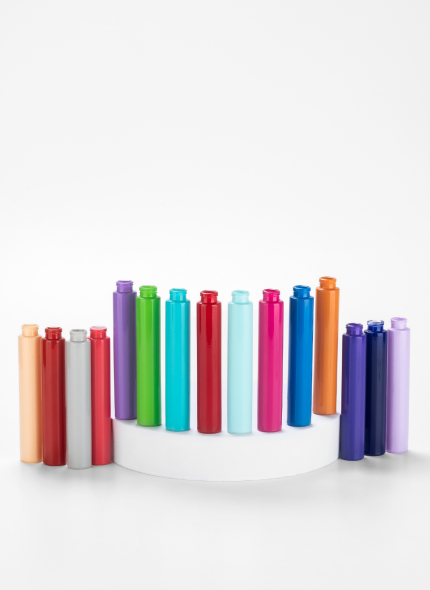
To promote and enhance the visual appeal of a set of roll-on bottles designed for cosmetic products, out client wanted to use winter and summer pastel colours in a glossy, opaque version. Designing, reproducing, and creating 18 different custom colour blends as per our client’s specifications was a challenging yet stimulating task, an opportunity to look for truly innovative solutions.
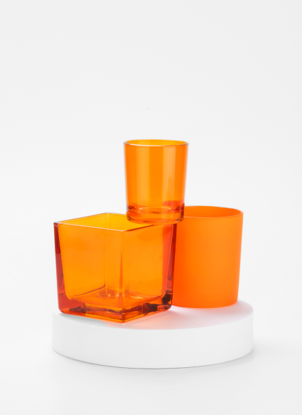
For this project we created three different coatings to be applied to various types of candle holders. After identifying the right colour in collaboration with the client, we created a transparent, a semi-transparent, and a fully opaque coating: one colour, endless combinations!

To decorate a set of perfume bottles, we created a unique range of nuances, starting from intense black and fading into various other colours, with transparent finishes. This was a demanding yet exciting challenge which resulted in the creation of elegant and unconventional finishes echoing the tones and scents of the Middle East.